Top 5 Responsive WordPress Themes to Improve Mobile Performance
In today’s digital landscape, ensuring your WordPress website is responsive and optimized for mobile devices is crucial. A responsive theme not only enhances user experience but also boosts your site’s SEO performance. Here are five top responsive WordPress themes from ThemeForest that can significantly improve your site’s mobile performance.
Top 5 Responsive WordPress Themes to Improve Mobile Performance:
Enfold – Responsive Multi-Purpose Theme
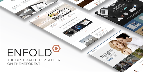
Overview: Enfold is a clean and flexible theme suitable for business websites, online shops, and portfolios.
Key Features: It offers a user-friendly drag-and-drop builder, multiple demos, and extensive documentation.
Mobile Optimization: Enfold is fully responsive, ensuring your site looks great on all devices.
Link: Enfold – Responsive Multi-Purpose Theme
Flatsome – Multi-Purpose Responsive WooCommerce Theme

Overview: Designed with WooCommerce in mind, Flatsome is ideal for creating stunning online stores.
Key Features: It includes a live page builder, large element library, and numerous pre-made demos.
Mobile Optimization: Flatsome is optimized for speed and responsive design, providing a seamless shopping experience on mobile devices.
Link: Flatsome – Multi-Purpose Responsive WooCommerce Theme
Betheme – Responsive Multipurpose WordPress & WooCommerce Theme
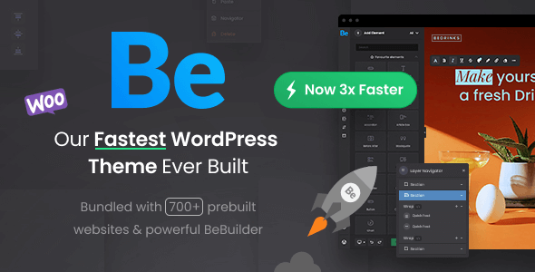
Overview: Betheme is a versatile theme with over 700 pre-built websites suitable for various industries.
Key Features: It offers a powerful admin panel, built-in mega menus, and compatibility with popular plugins.
Mobile Optimization: Betheme ensures responsiveness and fast loading times across all devices.
Link: Betheme – Responsive Multipurpose WordPress & WooCommerce Theme
Total – Responsive Multi-Purpose WordPress Theme
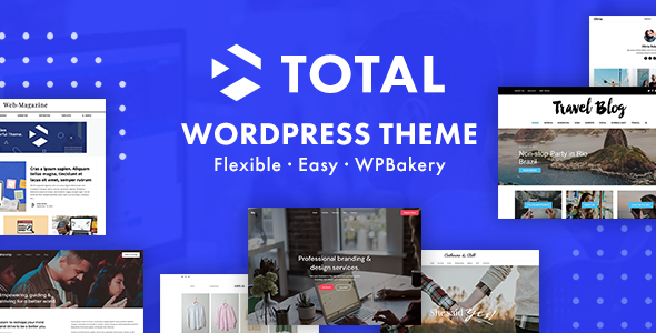
Overview: Total combines the power of the WordPress Customizer and WPBakery Page Builder to create any website.
Key Features: It includes a live customizer, multiple header styles, and a library of pre-made demos.
Mobile Optimization: Total is designed to be fully responsive and retina-ready, ensuring clarity on all devices.
Link: Total – Responsive Multi-Purpose WordPress Theme
Brooklyn – Creative Multipurpose Responsive WordPress Theme
-
- Overview: Brooklyn is a creative multipurpose theme suitable for portfolios, blogs, and business sites.
- Key Features: It offers one-click installation, a powerful admin panel, and multiple pre-built demos.
- Mobile Optimization: Brooklyn is fully responsive, ensuring your content adapts beautifully to any screen size.
- Link: Brooklyn – Creative Multipurpose Responsive WordPress Theme
Selecting a responsive WordPress theme is essential for delivering an optimal user experience across all devices. The themes listed above offer robust features and mobile optimization to enhance your site’s performance. Explore these options to find the perfect fit for your website’s needs.